**Disclaimer: No Pantone swatches were harmed in the making of this blog post…**

It’s that time of the year when Pantone announce their colour of the year, (Mocha Mousse in case you’re wondering) so as we wrap up 2024, we’ve been diving deep into the chromatic rabbit hole of brand development. Buckle up for a colour-charged journey that’s part science, part art, and entirely about listening intelligently.
Colour: The Silent Storyteller
Imagine walking into a room painted entirely in beige. Feels like a corporate root canal, right? Colour isn’t just decoration—it’s communication. It’s the difference between a whisper and a symphony, between blending in and standing out.
Take our recent project with a startup. They came to us thinking blue was the only corporate colour. We listened. We discovered their true brand essence was about breaking boundaries, not fitting in. The result? A bold colour palette that told their story before a single word was spoken.
The Psychology of Hue: More Than Meets the Eye
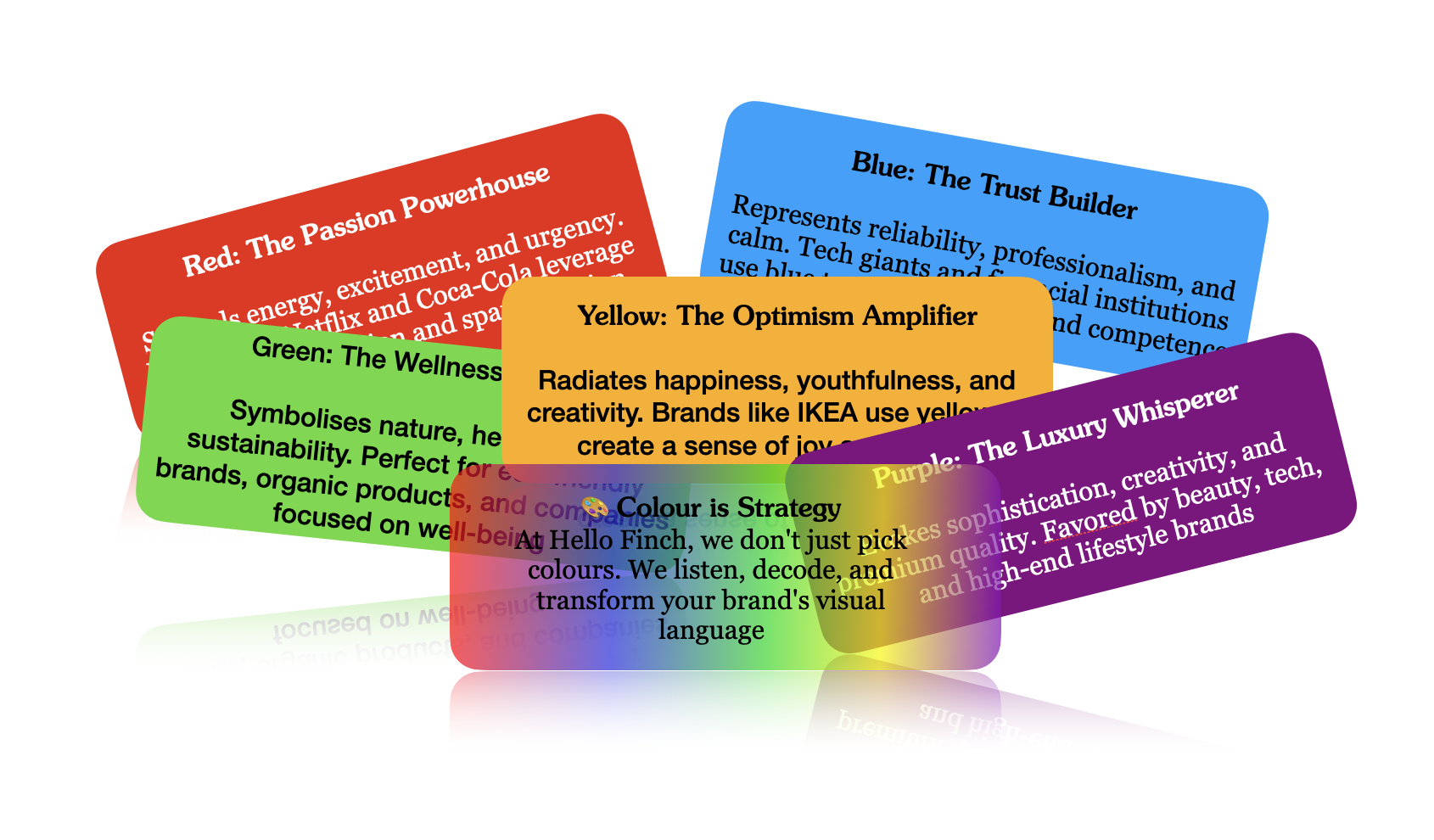
Colours aren’t just pretty – they’re psychological ninjas:
– Red screams “Look at me!” (Hello, Netflix)
– Blue whispers “Trust me” (LinkedIn, we’re looking at you)
– Green says “We care about the planet” (Patagonia, take a bow)
But here’s the twist: These meanings aren’t universal. What signals excitement in New York might signal mourning in Mumbai. This is where listening becomes an art form.
Cultural Colour Compass
We don’t just pick colours. We decode cultural landscapes. Helping a global food brand avoid a colour catastrophe in three different markets? Hint: What works in London might make consumers cringe in Tokyo.
The Listening Lens
At Hello Finch, our approach isn’t about telling clients what to do. It’s about:
– Hearing their brand’s heartbeat
– Understanding their audience’s unspoken language
– Translating those insights into a colour strategy that sings
A Playful Palette of Possibilities
Colour is serious business, but that doesn’t mean we can’t have fun. We approach every brand like a kid in an art studio—curious, experimental, and ready to make something remarkable.
Pro tip: The most memorable brands aren’t afraid of a little colour courage.
By the Numbers (Because We’re Strategic Like That)
– 93% of purchasing judgments are made on visual perceptions
– Colour can increase brand recognition by up to 80%
– The right colour can boost brand engagement by 25%
*Source: We listened to the data, so you don’t have to.*
Final Brushstroke
In a world of noise, colour is our way of cutting through. It’s how we help brands not just be seen, but truly understood.
Want to paint outside the lines with us? Let’s chat.
Hello Finch. Listening Intelligently.


